The Client:
MIT School of Mechanical Engineering
The Project:
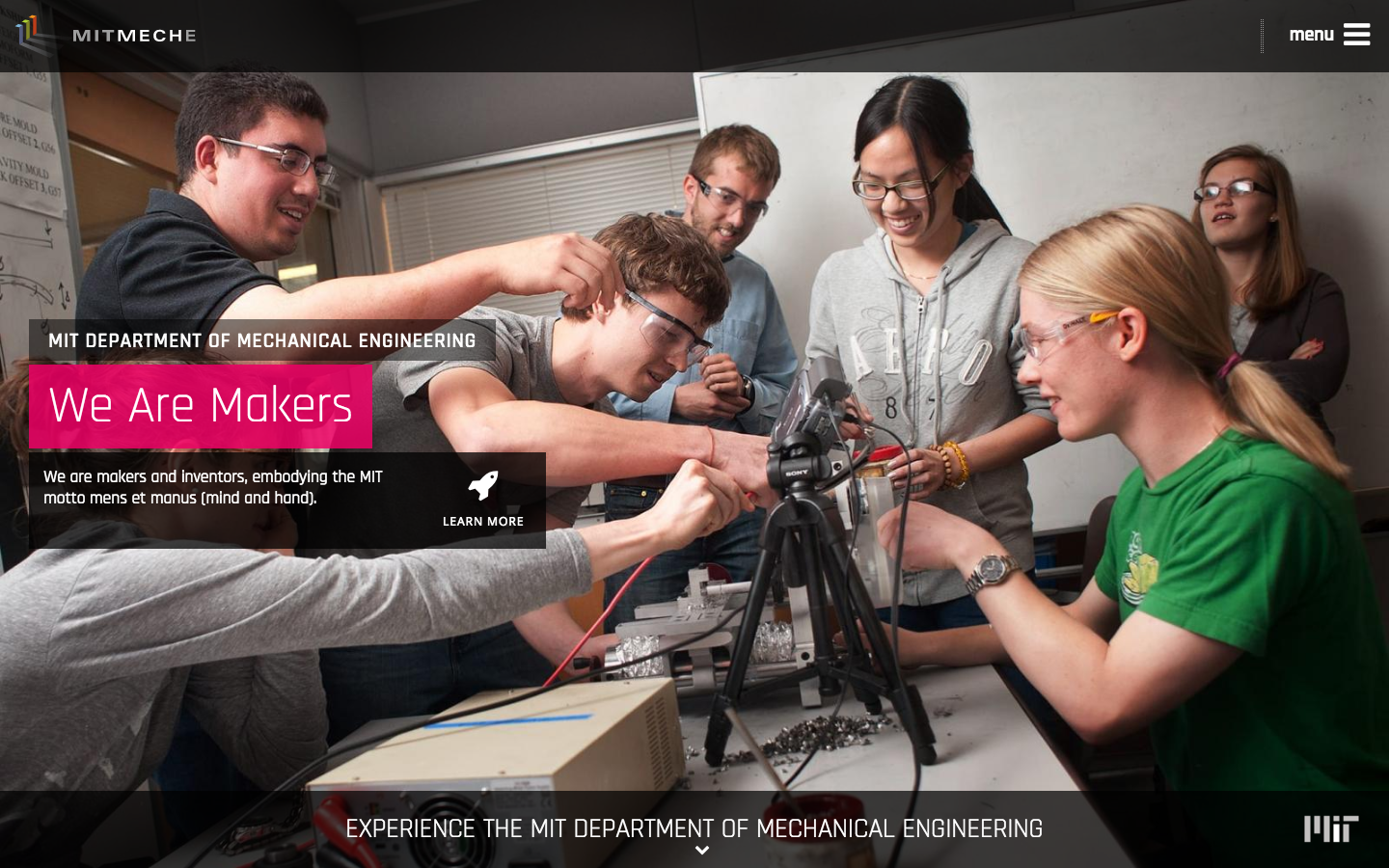
The MIT School of Mechanical Engineering—affectionately known as MechE—is one of the premiere mechanical engineering schools in the country. They needed a presence that exemplified the innovation, ingenuity, entrepreneurship, and energy that was truly alive at the university today and that emphasized the impact that the school has on the world around us every day.
The Approach:
Make no bones about it, creating a unique, well designed educational website is no easy task.
We laid the groundwork for this project in the way that we normally would, through Discovery Sessions. We assembled a larger committee of project stakeholders and through some fun exercises and free-form discussion, they helped us identify the target audiences, site objectives, and must-haves that we would need to address. We were also able to discover and identify the department’s true “Why” and start to develop the tone and feel of the department which would help guide the design process.
Once the discovery was complete, we really dug our heels in...
Content Architecture:
UX design is an invaluable part of any project, but just like when remodeling a house, it’s sometimes necessary to bring things back to the foundation and create a better base structure for the improvements.
The goal of most websites is to allow the user to find the information they’re looking for quickly and efficiently—whether that be a video, course information, or a phone number. And while UX architecture is usually the hero when people talk about this kind of thing, sometimes it’s necessary to bring it back to the actual content you want to bring to the user.
That was the case with the MechE website. Years of continually adding information where it seemed appropriate had created a web of duplicate and misplaced content that was not only confusing to users, but also making it more difficult to update information when and where appropriate.
First, we did a content breakdown of all of the existing information, added in the new content that we wanted to feature and reorganized it in a way that eliminated replication as much as possible and put information in a place that made the most sense for the audience.
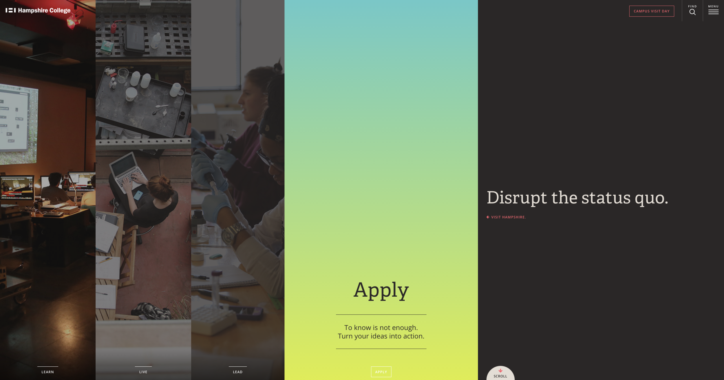
As we were working to align all of the content, we wanted to start to tell the story of MechE through the navigation. Impact, Research, People, Education and Culture—the first five navigation items—are the core of the MechE experience and also an appropriate and illustrative way to organize the main content of the site itself.
UX:
After we’d established the organization of the site’s information to a base level, we were able to start the UX process. We aimed to have 15-20 templates to work with in the MechE’s chosen CMS, and account for individual pages as necessary until we’d addressed all of the site’s content.
Achieving a balance of experiential and utilitarian design is almost always a goal of ours, and given the fact that MechE had a wealth of outstanding media to showcase on the site, we doubled down on needing to find a way to help the user feel the impact of the department through large visuals and subtle motion and transition without hindering their ability to find information quickly.
We also needed to be sure that each of the proposed architectures would be responsive enough to collapse and expand to different viewports on as many devices as possible, while maintaining the level design polish and accessibility we had earmarked at the beginning of the project
Another additional factor that needed to be taken into account was the fact that, as a sub-site off of the main MIT website, the information that was populating the site would be coming from varied sources in varied formats across the schools many data sources. We’d need to find and define the common elements that we would have access to, that we would then be able to use to present the content in a way that we still felt was as optimal for the user as it could be.
Design:
We were faced with the challenge of balancing an experiential design that was heavy in both media and content. These somewhat paradoxical challenges were crucial for us to work through as we looked to marry them into a very clean and beautiful experience.
The first step in the design process allowed us to look at an exhaustive list of content types, messaging platforms and media to then create a visual hierarchy that was consistent across the site. Deeply immersive visuals would represent storied content, either for marketing content or in rich media, while heavy content would adopt a more simplistic visual. We wanted to maintain the ability to present a vast amount of information that was both visually interesting, but carried a very clean and digestible layout.
From a brand perspective - we needed to find a visual tone for the story we had helped to defined earlier on. MIT MechE is changing the game in almost everything they do - and with that innovation - they are creating a real lasting impact in the world. So as we began the visual exploration to push these limits - we found it being taken to a more bold + deeply human place.
So the marriage of concept, content and tone brought us to a visual language that was steeped in personality and rich with integrity. Bold use of color balanced with openness and immersion. Our categorical approach to the design would help us to create a visual hierarchy to maintaining the brand across the site (both in the CMS and in editorial usage) that was both flexible and accessible.
Being held to ADA and WCAG guidelines also meant that flexibility and accessibility for the impaired held the highest priority - so our designs were challenged even more as we ensured that creativity and compliance did not compete. Something that designers have come to understand, is not an easy thing to balance.
Development:
In recent years Drupal has gained considerable popularity in the Higher Ed space due to it’s security, scalability, cost-effectiveness, and organizational powers. MechE’s decision to migrate to Drupal was one brought on by all of those things, and the fact that the standard had been set by the larger school to move to the platform to enable departments—and eventually professors and students—the ability to build around one, solid CMS.
But as anyone who’s tried to implement anything beyond a simple templated design will tell you, Drupal can be a real bear to work with.
Our charge was to not only get our front-end designs developed and implemented through Drupal’s theming system, but also to migrate existing data to the new CMS and integrate all existing feeds and repositories. For the latter part of that challenge, we partnered with experienced Drupal dev Chris Akeley of InnerMotion Web Development, but to ensure our designs translated as precisely as possible, we took things into our own hands.
Limiting your work to a certain number of templates can be, well… limiting. And while we wanted each section of the site to have it’s own personality, for efficiency reasons, we were also aware we couldn’t make every single section it’s own completely unique template. Our solution was to design and develop in a modular fashion that would allow us to create unique page templates from a consistent set of elements. Each one of these “parts” was developed into a full, stand-alone, working prototype and then ported over to the custom drupal theme to become a module which could be placed in almost any page or template. That all sounds a lot easier than it actually was, but you get the idea.
In the end, with the help of Chris, we were able to take our vision for the new MechE website and make it a reality not only in a visual sense, but also in a way that has allowed the department to have better control over their content while still maintaining the required automation (and more) that they’d been looking for.
The Recognition:
• Winner of a CASE Circle of Excellence Award (Individual, Sub-Website)
Role:
Brand and UX Strategist, UX, Copywriting, Project Management
Relevant skills:
• Brand strategy
• UX research and strategy
• Information architecture
• Wireframing
• Project management
• QA